EMMA COCKER- READING WRITING
This project responds to the experimental writings of Emma Cocker, a Sheffield-based writer-artist and Associate Professor in Fine Art at Nottingham Trent University. Her work explores the space between writing and art through contiguous writing—a subtle, performative, and collaborative approach—interpreted through a typography-based publication.
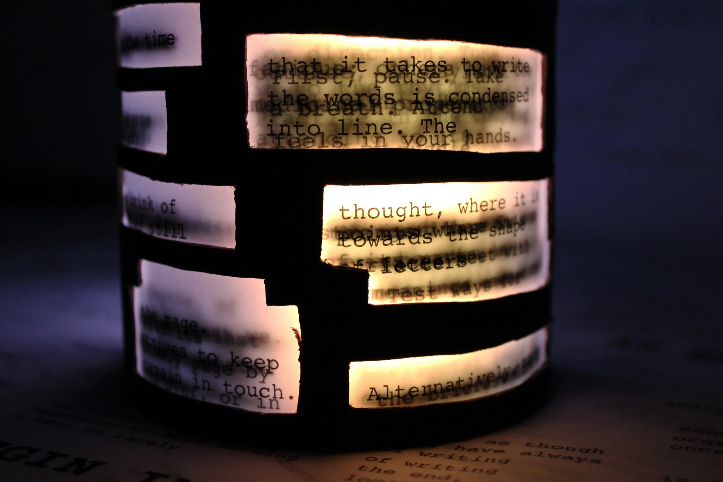
For my project, I explored the article Reading–Writing, a rich and descriptive piece that highlights the diverse ways individuals perceive the act of reading. My design centres on the theme of perception, using a rotatable curved-edge box to allow the text to be experienced in multiple ways. Depending on how the box is turned, different parts of the article are revealed, encouraging varied interpretations. I selected a typewriter-style typeface for its clarity and simplicity. This font aligns with the article’s theme by evoking a step-by-step journey through reading, making the text feel approachable and easily understood.
To enhance the concept of layered meaning, I printed the design on tracing paper. The transparent material allows overlapping text to be partially visible, creating a sense of depth and mystery that reflects the complexity of perception in reading.
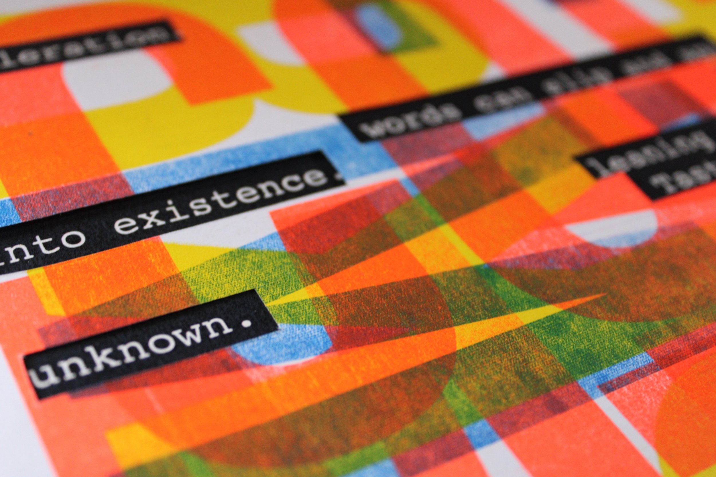
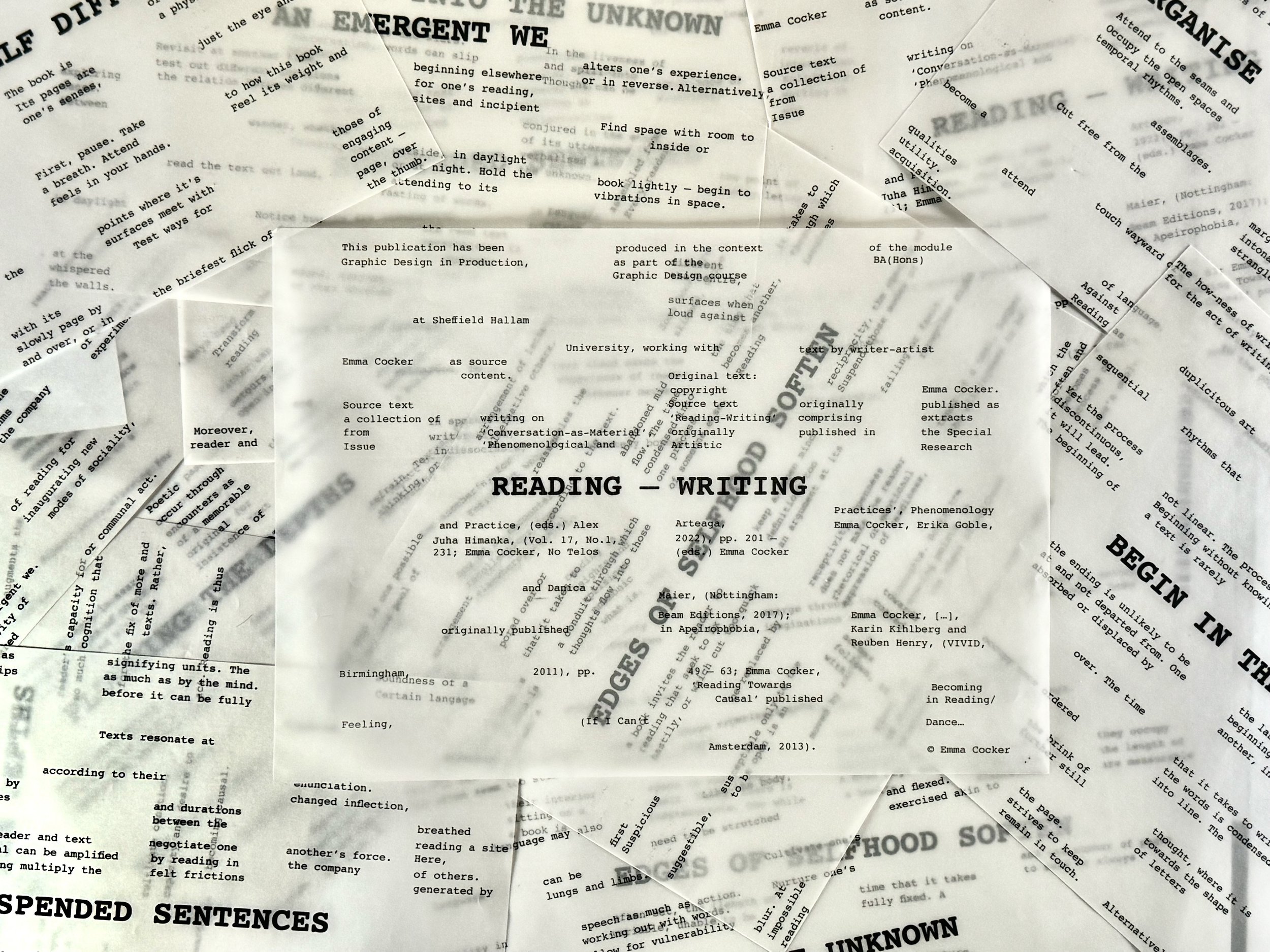
I also explored a variety of compositions throughout the project. One format presented the work as a book, featuring a cut-out front cover shaped like a cylindrical tube, allowing the inner pages to be partially visible from the outside. Additionally, I created a layered poster design using a Risograph printer, combining vibrant overlapping typography with layers of tracing paper to highlight select words and phrases. Another version included cut-out sections in the top layer to reveal hidden text beneath. These experimental iterations brought together a collaborative and multidimensional body of work, each outcome offering a unique perspective on the core themes of the article.